
Out of Sorts: A Look at a 19th-century Printing Office
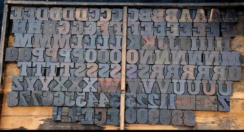
“Out of Sorts” is but one of the many expressions and idioms that can be traced back to the printing world. A sort is another name for a single piece of type, so when you’ve run out of letters, you’re literally, “out of sorts.” You can see the leap leading to the way we typically hear it today… The video posted below shows everything but an office out of sorts.
Two weeks ago, I shared a 1949 issue of the New York Times from my collection. In this video, I wanted to share an item I often use in my classes on book / printing history: “Specimens” published by Rand, Avery & Co. (Boston: 1879).
Rand, Avery, and Company (1851-1886) was a Boston-based book and map printing company active in the late nineteenth century. The firm was founded in 1851 by George Curtis Rand (1819-1878) and his brother-in-law Abraham Avery (1824-1893). They were based in Cornhill, Boston, and, for a time, were the largest printers in New England. Their catalog included Harriet Beecher Stowe’s “Uncle Tom’s Cabin” (1851), Harriet E. Wilson’s “Our Nig” (1859), and Mark Twain’s “The Prince and the Pauper” (1882). Editor and publisher Moses King worked at the firm before founding the Moses King Corporation in 1888.
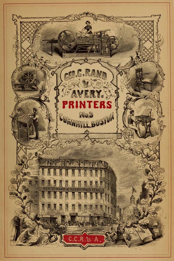
The images here are from their 1874 collection of “Specimens.” Type specimen books are specialized publications that showcase the various typefaces available from a particular type foundry, designer, or printing firm. Historically, they serve as a catalog or portfolio of type designs, displaying each typeface in various sizes and styles to illustrate its versatility and aesthetic qualities. These works document the evolution of type design, providing insights into the styles and trends of different periods. They preserve the visual history of typography, showcasing how typefaces have changed over time and highlighting design trends of a particular period. They can reveal how typography was used in advertising, branding, and publishing, giving context to the historical period’s communication styles and aesthetics, and serve as essential reference tools for designers, printers, and historians.
Of course, the type is not included in this video. The images here (also used in the firm’s 1865 catalog) illustrate the printing processes and daily operations of a printing company in nineteenth-century America. The cuts here walk you through typesetting and imposition; proofreading; inking and printing; drying; binding; and managing inventory, shipping and distribution. In this way, the book offers an added bonus for my classes beyond looking at typography.
I hope you continue to share items in the coming months. If you like these videos, please like or comment via this blog or subscribe to my YouTube channel.


You must be logged in to post a comment.