Goody Goudy!
If there were an individual, readily recognized quality, or characteristic which the type designer could incorporate in drawings that would make any one type more beautiful, legible, or distinguished than another, it is obvious that only type of that kind would be designed.
~Frederic W. Goudy.
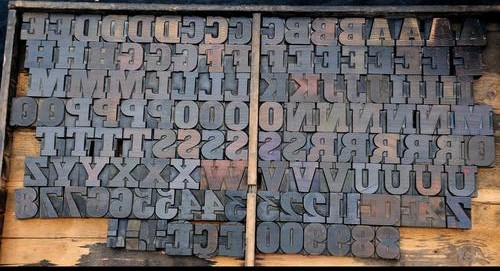
This month marks the 100th Anniversary of the creation of Goudy Old Style. Designed by Frederic Goudy (and commissioned by The American Type Founders Company), the type–an elegant beautiful gothic/serif hybrid– was an immediate success in the newspaper and magazine industries and, in particular, “ad alley” and is still the font used by Harper’s Magazine.
 Goudy, the man, (1865-1947) has always been an interesting character to me because of how (and how late) he entered the design world. He actually worked as a bookkeeper until almost 40 years old when he co-founded Village Press, in Park Ridge, IL. Modeled after the Arts & Crafts Movement, he began a career in type design, one in which he jumped in from scratch, almost completely self-taught. He not only designed but also cut his own type. His first successful font was Kennerley Old Style, design in 1911 and first used for an H. G. Wells anthology.
Although he would produce about 125 typefaces–including Californian, a font specifically created for the University of California Press–in the next forty years, Goudy Old Style remains his most famous. In 1933, The New Yorker profiled him as “Glorifier of the Alphabet”, and a 1942 article in Popular Science argued that Goudy created “more usable faces than did the seven greatest inventors of type and books, from Gutenberg to Garamond.”
Today, we most often encounter his work as digitized fonts, but there is much to learn from his ideals on printing and typography and his approach to design. Goudy had a deep understanding and passion for both medieval and contemporary typeface; his legacy is the ways in which he made historical type relevant again.


You must be logged in to post a comment.