
Reading by Design … The Great Gatsby
Next semester, I’m teaching another class related to book history and publishing. This course will examine the history and evolution of book design and, specifically, cover art. The question that will guide our weekly readings and assignments is simply: “How do we judge a book by its cover?”
Book covers–that is the design and cover art of books–is a relatively new innovation. Although some Victorian books included illustrated wrappings, cover art was a product of the early twentieth century, an effect of the economic boom, technological innovations and retail-advertising shifts of the 1920s. The medium attracted a new group of artists and often reflected the modernist trends originating in Europe.
My course is an exploration of books and book jackets as planned and produced concepts and objects; its emphasis will be placed on design choices and creative solutions and dedicated to Visual Arts and Graphic Design students, who will not only read and write about the history of book cover art but also submit portfolios on their own original work in the genre. It combines lecture, workshop & critique, hands-on demonstrations, seminar discussion, and individual presentations.

The class will be loosely organized chronologically, looking at five specific areas: the golden age of book covers during Roaring Twenties; the rise of publisher logos and series’ identities, seen in the rise of Penguin; the post-war period and the impact of designers like Jan Tschichold and his concept of “New Typography”; postmodern design in the 1970s and 80s; and the digital revolution and ongoing changes, challenges, and opportunities related to design elements in the electronic age (and with multimodal publications).
Because of their popularity and dominance in the marketplace and in part because of their social positioning as the pinnacle of the creative-literary spirit, novels have provided an especially rich field for book cover design. As such, novels will be a focal point for the class. The content, style, and form of these literary works (and the publishers’ marketing strategies in promoting these works) both challenge and liberate designers’ conception of what is possible for cover designs. The questions posed to the designer is how the cover might suggest or reflect not only the contents and context of the book, but also how it addresses the style or unique qualities of the work, packages or “sells” the book to its potential readers, and cohesively works within the respective publisher’s own style and existing catalog.
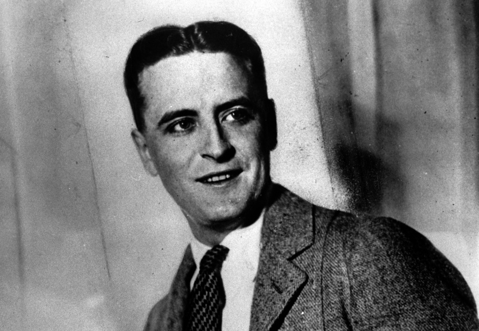
Francis Scott Key Fitzgerald (AP Photo).
For one of the larger writing assignments, I hope to ask students to investigate the ways in which the cover art for one particular literary work evolved over time and how those changes reflect specific periods, aesthetic trends, etc. Prior to distributing this work, I hope to hold discussions of a couple of titles. The difficulty, in part, is to find a work that many of the students know or that some students in the class might feel comfortable in sharing the plot of the work to the rest of the class. Although it might not necessarily by pressing for this assignment specifically and I could manage a brief talk or related reading on this for that session, it would be helpful for them to begin thinking about how plots and literary movements / styles connect to larger trends, issues, and questions, economically, politically, and aesthetically. I hope to also write an assignment in which students create their own rendition of a “classic” (broadly defined) literary work.
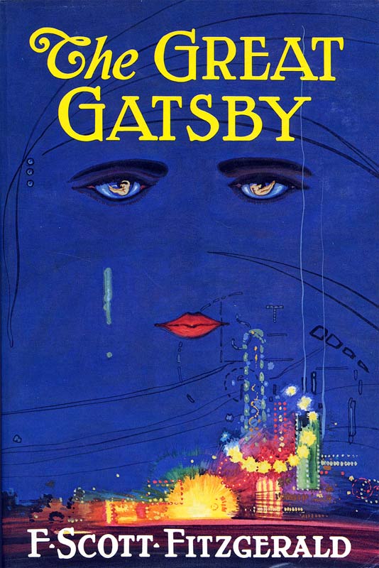 One of the contenders for this seminar at present is F. Scott Fitzgerald’s The Great Gatsby (1925). It’s usually at the top of lists on the greatest novels of all time and is arguably one of the most recognizable covers in American literature.
The art was designed by the Spanish portrait and poster artist Francis Cugat. In a now famous 1991 essay, Charles Scribner III described the unique relationship between the artwork and the book. The publishing icon traced the development of each and collaboration between artist and writer, noting that the artwork was actually completed before Fitzgerald had completed the final manuscript.
In a letter to his editor Max Perkins, Fitzgerald actually notes that he incorporated Cugat’s haunting image into the books . . . in the form of the recurring billboard for oculist Dr. T.J. Eckleburg:
The eyes of Doctor T. J. Eckleburg are blue and gigantic — their irises are one yard high. They look out of no face, but, instead, from a pair of enormous yellow spectacles which pass over a nonexistent nose. Evidently some wild wag of an oculist set them there to fatten his practice in the borough of Queens, and then sank down himself into eternal blindness, or forgot them and moved away. But his eyes, dimmed a little by many paintless days, under sun and rain, brood on over the solemn dumping ground.
Cugat’s earlier sketches were also found in the 1990s (below) and show floating eyes, floating above the writer’s “valley of ashes.” This work might best be juxtaposed with the more recent book cover published alongside the release of the 2013 Leonardo DiCaprio film adaptation. In April 2013, Julie Bosman wrote “Judging ‘Gatsby’ by Its Cover(s)” which addresses the original and new cover designs.

My hope for the class is to bridge gaps between literature and graphic design; history, theory, and practical/technical design; and textual, image, typographical conventions and the form and structure of the book. It allows students to pursue the production of digital and traditional projects related to the topic of the course. Course objectives include the following:
- Understand type/image relationships in cover design.
- Understand the process of designing a cover.
- Realize the power of a visual metaphor.
- Understand the importance of appropriate typeface choice.
- Value the research process necessary to book cover design.
- Understand key historical movements and trends related to book covers and publication design.
In the upcoming series of posts, I hope to reflect on book covers and their as a way to begin preparation for this course. And, as I’ve done with my History of Paper course, “Mulberry, Mummies and Marshes,” I hope to share course progress in the fall. In the meantime, I can think of no better way to begin than offering a gallery of some of the (English language) cover designs of arguably the great American novel, F. Scott Fitzgerald’s The Great Gatsby. This includes a couple of fan-produced works. The question is, can you spot them?
")

")
")

")


")


")
")


")


")

")
")
")


One comment on “Reading by Design … The Great Gatsby”
Leave a comment


Pingback: How to Judge a Book by its Cover | The Projector